What is the Best Business Proposal Font?
It’s a great pity that many otherwise fantastic business proposals fall flat. A common theme apparent in the vast majority of rejections is based on the golden rule. The authors of these failed proposals did not make first impressions count, at least not in their favor. And one of the questions that probably was never asked that may have helped was, “What is the best font for a business proposal?”
While the choice of font may seem inconsequential, it does in fact play a very important role. On a sub-conscious level, font tells the reader more about what they are reading. Fonts help set the tone. Consider typical outdoor signage used by a nursery school. The letters are large, simple, bold and contain an assortment of bright colors. Tots and toddlers play school. They give the impression of fun.
Signage outside a lawyer’s office would be noticeably different. The choice of color would be uniform throughout, while the font itself would be smaller. It would imply that this is a business environment. Do not expect to find unicorns dancing on any rainbows here. J S Shark and associates. Attorneys at law.
It should be evident that the font used in a proposal will be very different from that used in nursery school signage. The subliminal message should be clear; this proposal is serious. It means a lot, has been well-researched and contains information of value. It was not banged together using a sloppy approach. It should speak for itself. It needs to say, “I am important. Read me in my entirety. Pay attention to my content. It may lead to a very rewarding experience, benefiting both your business and its clientele.” So what is the best font for a business proposal?
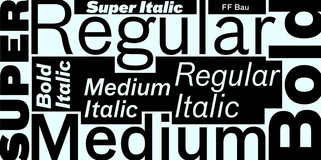
Before answering that question, it is important to distinguish between the different types of fonts. There are literally thousands of fonts available. Some are free, others not. Some fonts are exclusive. They are used to establish or entrench a corporate identity. An example here is the Coca Cola font with its famous curling ribbon.
Fonts such as these may have patents or legal clauses (similar to logos) which prevent their commercial use by unauthorized 3rd parties. Some fonts are all in upper case, and others in italics only. All of these can be classed into two separate categories. Serif and sans-serif.
Serif fonts, such as Times New Roman, have small “feet” at the bottom of certain letters. A further characteristic particular to a serif font is the “curly bits” found at the top and bottom of certain letters. These “frills” cause the eye to travel in a straight line. This means that serif fonts are easier to read when they are printed into document format.
If the proposal is going to be submitted as an actual document i.e., printed and not as an electronic submission, then the body of the proposal should comprise a single serif font used throughout. I tend to stick with what works well. For me, that is Times New Roman. For headings I generally go with a sans-serif font like Verdana or Helvetica. On the rare occasion when I require a large heading which will stand out above the others, then Arial Black is the way to go.
Fonts which are sans-serif do not have the “frilly bits.” They include examples such as Arial Black and Verdana, neither of which has letters with feet or curly bits. These fonts were mostly used to distinguish paragraph headings from the main body of text. With the arrival of electronic communication, it was noted that sans-serif fonts are easier to read on computer screens than the serif versions. With some screens set to a low resolution, the “frilly bits” associated with serif fonts tend to make the font look blurry or out of focus. This would reflect poorly on your proposal.
If your proposal is going to be submitted electronically, then the body of the proposal should comprise a single sans-serif font, to be used throughout. Verdana or Helvetica are excellent choices for the digital layout and are making their socially acceptable appearance in some printed formats too.
Headings or the introduction of new ideas should differ from the main body of text. Most people agree that a simple Arial Black or Verdana as a font for headings will give your proposal a clean and professional look. Avoid “loud” fonts such as Goudy Stout. Also avoid “hand-written” fonts or fonts that are childish or too “busy.” By busy, I mean overly elaborate fonts which contain elements of advanced calligraphy.
Again, choose only one font for headings and stick to it throughout. Having different headings in different fonts, using various sizes and colors, while alternating between bold and italics does not work. Don’t do it; just don’t! Your proposal will end up looking like a ransom note from a cheesy B grade movie, rather than the slick and professional business proposal you need to deliver.
(Photo courtesy of FontFont)
I think most people will ignore this advice because they will assume that a font really doesn’t matter when you are writing this proposal. This would be a huge mistake on their part. As a person who looks at many business proposals each day, one that is written in a font that is easy to read makes a huge difference. If you are going to spend days putting together a proposal, it makes sense to take 15 min. to make sure you have the right font to make it as good as it can be.
As long as you use a standard font and don’t try to get all cutesy, you should be fine when writing a business proposal. It’s when you start think of using weird or unusual fonts that you’re going to get yourself in trouble.
I find that Arial or Times New Roman are two of the most widely used fonts. They look professional and are easy readable. Those characteristics are two of the most important aspects when you choose a font for business.
I never thought about the font I used before reading this article. I always use the default font, but maybe I should reconsider that. It’s hard for me to believe a font would make that much of a difference if a standard one is used. I can see how a strange or weird font could cause issues, but not a standard one.
It’s surprising how many people try to make business presentations “fancy” by using an unorthodox font. it actually has the complete opposite effect and makes the proposal unprofessional looking. When in doubt, always go with standard fonts. Correction: ALWAYS opt for standard fonts.
This really does happen far too often. I don’t know why people think that fancy font will make their presentation better because it never does. All it does is distract from the actual presentation. This is especially true when it’s difficult to read the font, and most fancy fonts are difficult to read. Use a font that is readily recognizable by everybody and easy to read and you’ll be far ahead of the game.
Font of a sign can really mean a lot to the business. I love the examples you give and how they are on the different end of the spectrum. Definitely want a font and font color that best represents the business yet eye catching at the same time.
There are so many things to consider when creating a business proposal, how is anyone going to be thinking about the font for the proposal. This just seems like overkill to me.
It may seem like overkill until your business proposal fails because it was difficult to read, or looked too “Cutesy” Details are important and the more you can make flawless, the better chance at success you have. Sure, font isn’t as important as the content of the proposal, but it can still keep you from having the proposal approved.
Thank you for this. I’m always looking for little edges when I create a business proposal and this is exactly the sort of thing I love to find. It helps me stand a little above the rest, something I always strive to do.
I need to know exactly what is the best font for a business proposal. This gives me ideas, but it doesn’t tell me the exact font I should use. How do I know the exact font so I can create a great business proposal that everybody will love?
The best font will depend a bit on your specific proposal. If everyone used the exact same font for all their business proposals and business writing, it would no longer be the best. Variety is important as well. You can’t have someone spoon feed you the answer. You have to use some of your own brain to pick the correct one for your proposal.
Well, fonts do matter. You need to ensure it is easy to read and also looks neat. In my opinion using basic fonts will be much better than trying to impress with fancy fonts that might be difficult to understand in the end. It’s always better to err on simple than to go overboard.
Unless you know a lot about fonts, stick with the basics. If you don’t know a lot about fonts, the last thing you want to do is experiment using some funky style. There is nothing that will make you stand out more as an amateur than to use a font that you think is stylistic when you don’t know anything about fonts. These that to the experts. If you have to choose a font, choose a default font.
What font is the best to use for my business proposal?
Did you even read the article? I think you might want to do that before asking the question again since it does answer what you asked. Granted, it doesn’t say specifically which font exactly is best for business proposals, but it does tell you the type that you should be looking at. If you have to ask this question, though with a standard font.
FONT CHOICE IS HUGE, and I can’t believe there are people out there doing business proposals without considering their font and delivery style (digital or printed).
As for the person who wanted a definitive answer, studies have been shown that Baskerville is the most believable and least objectionable font. As a serif font, however, one needs to consider its use if the proposal is to be submitted digitally, as it MAY create a slightly more difficult read.
Come on, let’s be real here. Font choice really doesn’t matter all that much in the entire scheme of a business proposal. I guess if you are type A and need everything to be perfect, let your anal hyperactive needs shine through, but for most of us, the font isn’t something that should be of much concern. Definitely not a top one. The actual proposal is much more important!
Who says we’re not real here? and who says the discussion on the font is at the top one? Yes, the font is not something that should not be of much concern compared to the actual proposal. But we are here to study, discuss, and do further research about it how to spice up a certain proposal. You may be on the wrong page of the discussion.
Do people actually spend time thinking about things like this? If you’re writing a business proposal, who takes the time to think about the font that is being used? Most people just tried to get the business proposal done. I don’t know anybody who uses a font other than the default one that they happen to be writing in when they are making the proposal. This all seems a little ridiculous to me and over the top anal. If you’re this worried about your business proposal being perfect, you’re likely to much of a perfectionist to actually get up business proposal approved.
Small details can sometimes make you stand out. It shows that you take your business proposal seriously and have spent time considering all aspects of it. This may not be as important as the business proposal itself, but it can show your commitment to detail when giving one.
In addition to choosing the proper business fonts, can I also point out that there is no need for excessive color. It amazes me how many times people color the font when it’s not necessary. It doesn’t make it stand out. It makes it harder to read. Stick with standard black for business proposals and don’t try and get fancy with color.
I can’t agree with this more. It doesn’t happen very often, but when it does it’s just cringe worthy. I’ve seen business proposals come in pink which is absolutely ridiculous. If you have to resort to coloring your proposal in an attempt to make it stand out, you don’t have a very good proposal in front of you. A good business proposal will stand on its own merits.
What is the proper font size to use for business proposal? Should it be a standard 12 point or is it okay to vary it to what you like? I personally like 14 point and was wondering if it was okay to use that in my business proposal instead of 12 point. I would love to hear any opinions from those who review business proposals as to the best way to proceed.
12 point font is typical. I wouldn’t make it any smaller. 14 point might be OK, but you want to be careful. If you have any doubts, ask the person you will be giving the proposal to if they have a preference. That’s the safest way to approach it.
Just make it readable, people. Seriously, you’d be amazed at how many proposals come in fonts just make it difficult to read. If I see a proposal that difficult read, I’m not going to read it. I have too many coming across my desk, and my automatic reaction is if the person couldn’t take the time to make the business proposal readable, then it’s likely not going to be very good business proposal. Simple as that.
I’ve never understood why people try to make things fancier than they need to be. To me, it’s a sign of desperation that the ideas in the proposal aren’t good enough to stand on their own. If they were, there would be no need to try and make it “prettier” than it needs to be. fancy fonts are nothing more than fluff added to the proposal to try and make it look better than it really is.
I might agree on the point, however in my experience many people is concerned about the fact that readers are too busy to actually read the whole document so they feel the need to make it more ‘easy’ for the reader with fancy design
Doesn’t using an unusual font make my business proposal stand out from the rest? I use unusual fonts so my proposals are remembered and stand out when managers look at them. I also use different colored paper for the same reason. My proposals always get noticed due to this and the worst thing is for a proposal to not get noticed.
NO!!! It makes you look desperate and actually takes away from the proposal. You want the proposal to stand on its own two feet without any gimmicks to stand out. If you have to rely on gimmicks, then you proposal isn’t strong enough and you need to rework it.
If you think you need your proposal to stand out beyond the information that’s in it, then you haven’t written a quality business proposal. It’s really that simple.
I think all the comments confirm font choice is a secondary consideration. It won’t help if the business proposal isn’t quality and it can hurt more than help if done incorrectly.
There are far more important things to worry about than font when putting a business proposal together. If you are so anal that you must figure out the perfect font, you’re likely too anal to actually turn the business proposal into reality.
I have to laugh at this entire comment thread. You people need to get a life. Why are you spending your valuable time arguing about business proposal fonts rather than working on your proposals?
What about business documents in general? Are there different fonts that are best for the different type of business documents that are shared among co-workers or is it the same for all business documents?
It is a solid article. Correct in every respect.
But then, why was a serif font used to write it?
it’s all about the 1% ers…we assume your document..no matter what type style is written about your high quality service or product. Font size and style is important. Think about trying to make it hard for people to read to prove the point. Write Language from Alan Pease is a good one. Likewise for those of us that sell, just google David Ogilvy and see not only font and size but layout. If the thread is on proposals, then evidence is key…and David researched where eyeballs go and what makes it easier to read. Not considering these points means you are perfect and we look forward to buying your book.
To the author: After you choose a dynamite font for your proposal, you may wish to look up proper usage of the word “comprise.” It was never used correctly in the article.
I am pretty sure the topic mainly focused on the Project Proposal font. You may be looking for the topic of “business plan content” and the like.
Font, style, colors, and even graphical representations of every are now being looked into as some factors of credibility, professionalism (scientific research)
A good way to tell if fonts are important is to look and see what the best in industry does. Google, Apple, Samsung, and even ExxonMobil all have their own custom typefaces, which took considerable time, effort, and expense.
If a little time picking one that’s already available can make a difference, why not? Or find a professional one for sale. You don’t have to research a new font for every proposal.
Also, on a more practical level, Times New Roman does not OCR very well. This could impact customer experience. That’s one reason I’m spending time finding a good one for contracts.